
The easiest visual interpretation I have come up to explain/illustrate User Experience Design.
For a recently coined term, and by recently I mean early 90’s, it is nowadays when we are getting more familiarity with such term and why it is important to consider in the planning phase.
Inherently the term it is quite simple, it conveys the idea that there is a byproduct of the user interacting with a digital platform (website, ATM machine, mobile application, museum/movie theatre kiosk, manual, object) it creates a so called experience and such should be the most efficient leading to completion of the desired result/use(s), otherwise it fails to fulfill the particular user needs, if so the user it is likely to withdraw and possibly not come back after few attempts. UX Designers main tasks are to research the user preferences and behaviours so the product usability it is maximized, therefore a successful one.
In spring 2020, I gave an onsite presentation in the British Columbia Institute of Technology about the advances of our organization website project at the time, though I made part of my presentation this explanation below to simplify what some will consider a unheard and complex term: What it is UX and why it is important to us, more specifically to our organization?
Please take a look at these two below images and ask yourself if you can understand what they are? what discernments can you see? what are they for? how do you interpret them? what is their purpose?
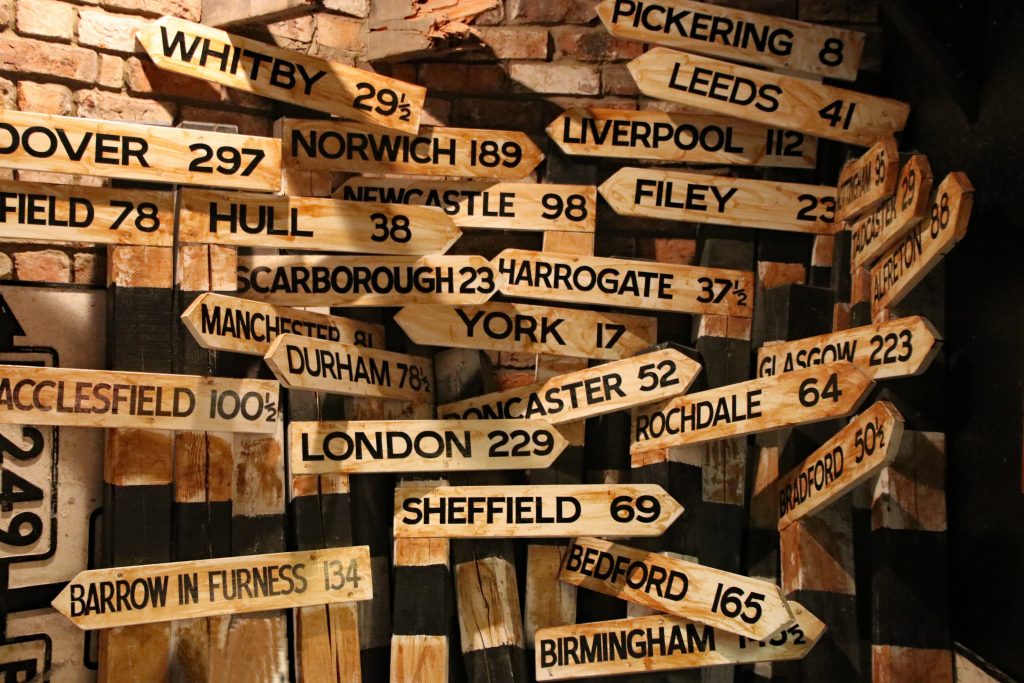

In comparison we could say that image a) has several overlapping arrows, they all point different directions, we notice the same wood material, though there are different shapes, names, numbers we cannot accurately say what these names and numbers depict (at least not right away, we will need some context here to do so) my guess it is that could be an exhibition of some kind perhaps historic and involving cities or towns of England. On the other hand, we can comprehend several assumptions from image b) it is geographical, looks like a wayfinding piece, items are colour coded, they all point a different angles/directions towards the city location names across the water and show distance in kilometres.
We could argue both pieces are very similar in semantics, materials, even conceptually but the image b) does a more efficient job showcasing a clearer story, it is intuitive, not necessarily more expensive/elaborated and it achieves better holistic execution. If we will like to add to the usability in our site we will choose to have these characteristics. User experience design (UX) applies to many industries not only interface design. It also includes industrial, graphics and physical interaction.
Back to the explanation on why should we care?
In the creation of a site it is crucial to look at our audience(s), cater to their specific needs and facilitate all interactions. Think about how we all (users) when we visit a site, there is always a mission, one or several specific goals. It can be read the news, do a transaction, watch a video; If the sites does not facilitate the user’s mission it will be hindering it instead.

Sources
- Stevens, Emily “The Fascinating History of UX Design: A Definitive Timeline” Blog Post Type. Career Foundry. Published July 12th 2019. Accessed 2020.
- Fauxels, Louis, Pexels. Accessed 2020.